Objective:
Create a brand identity for a Ukrainian buffet-style restaurant in Chicago's Ukrainian Village.
Tools:
Illustrator, Photoshop and Indesign
Role:
Art Director/Designer
Duration:
October 2024-December 2024
What is Skorochod?
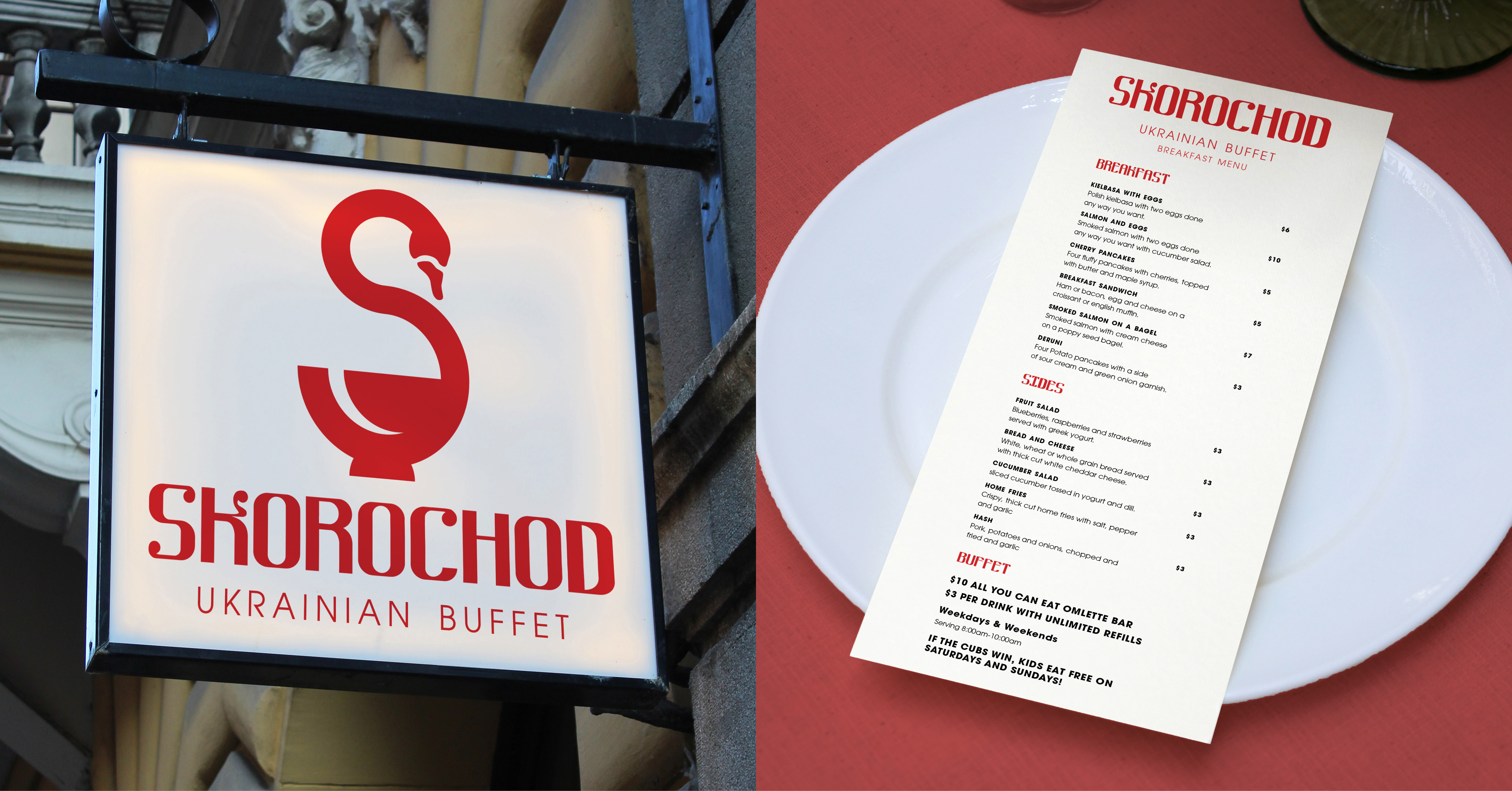
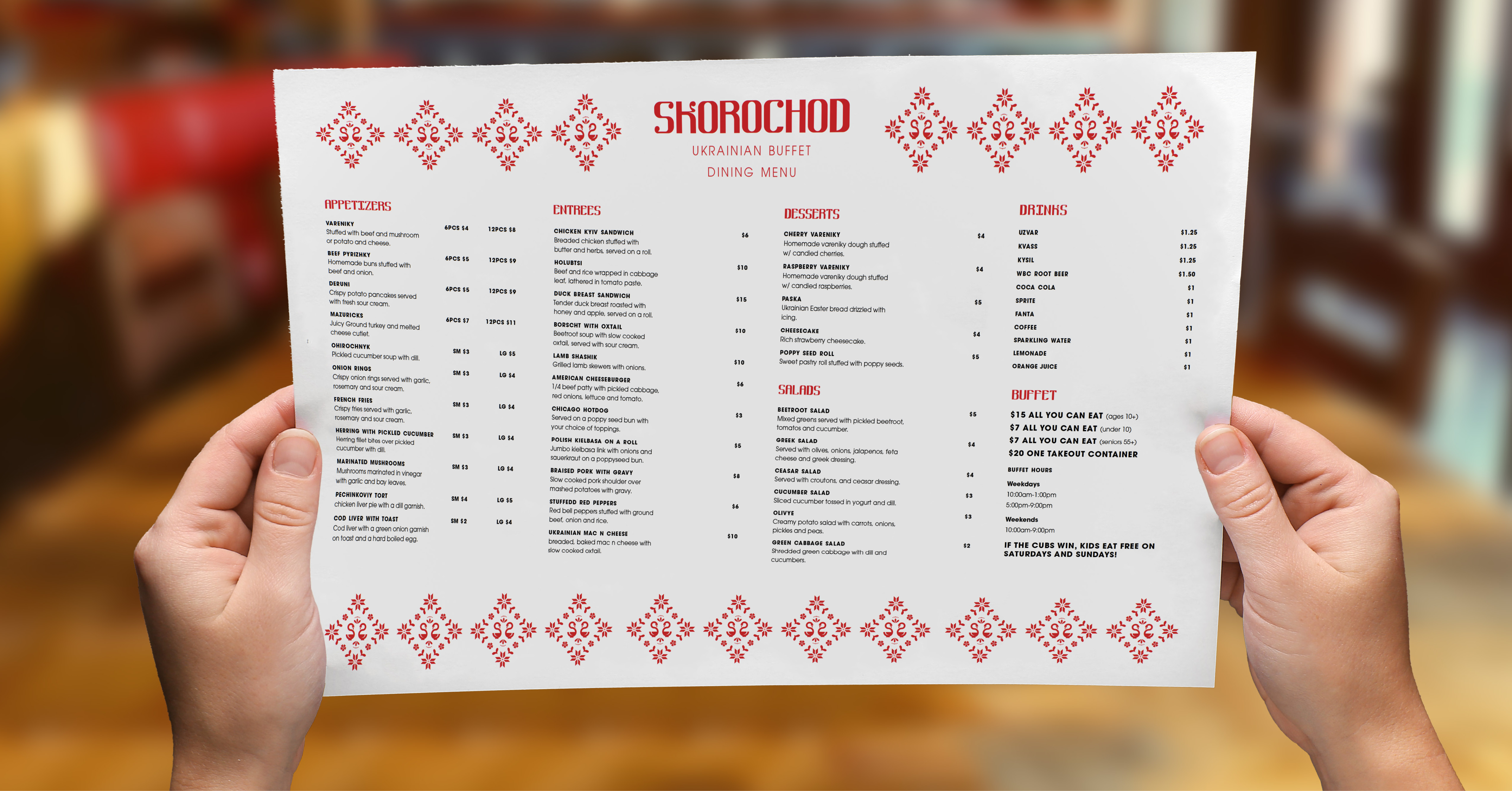
Skorochod is a Ukrainian-American buffet-style restaurant located in Chicago’s Ukrainian Village. Skorochod serves Ukrainian and American comfort foods for those craving a taste of home.
True Line
Whether you're across the ocean or right down the street, you're never too far from a taste of home.
Key Terms
- Family Friendly: perfect for large family outings, kid-friendly and affordable.
- Plentiful: enough food for everyone to share. Nobody leaves hungry.
- Food as a Love Language: food is life. Giving somebody food or cooking for them shows you care about their well-being.
Who is it for?
Skorochod is for Ukrainian immigrants in Chicago as well as people of Ukrainian heritage. The buffet-style nature of the restaurant encourages large parties to come and share a meal. Traditional Ukrainian dishes are served as well as American food.
The Brand
Skorochod is meant to feel warm and inviting. It's not exclusive. It's not high-class. Skorochod is a restaurant for anyone looking to try Ukrainian food or people craving a dish they feel a strong nostalgia for.
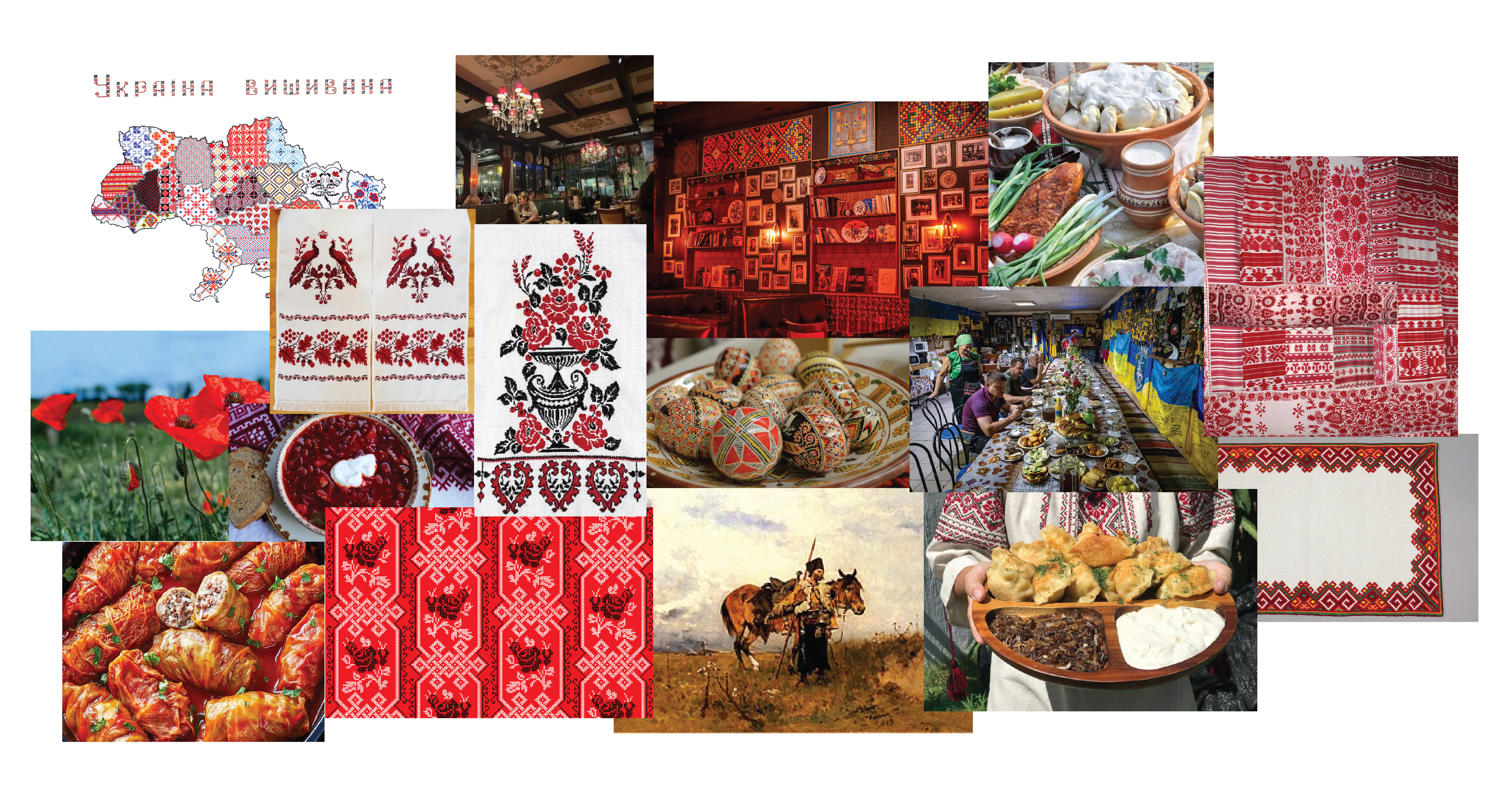
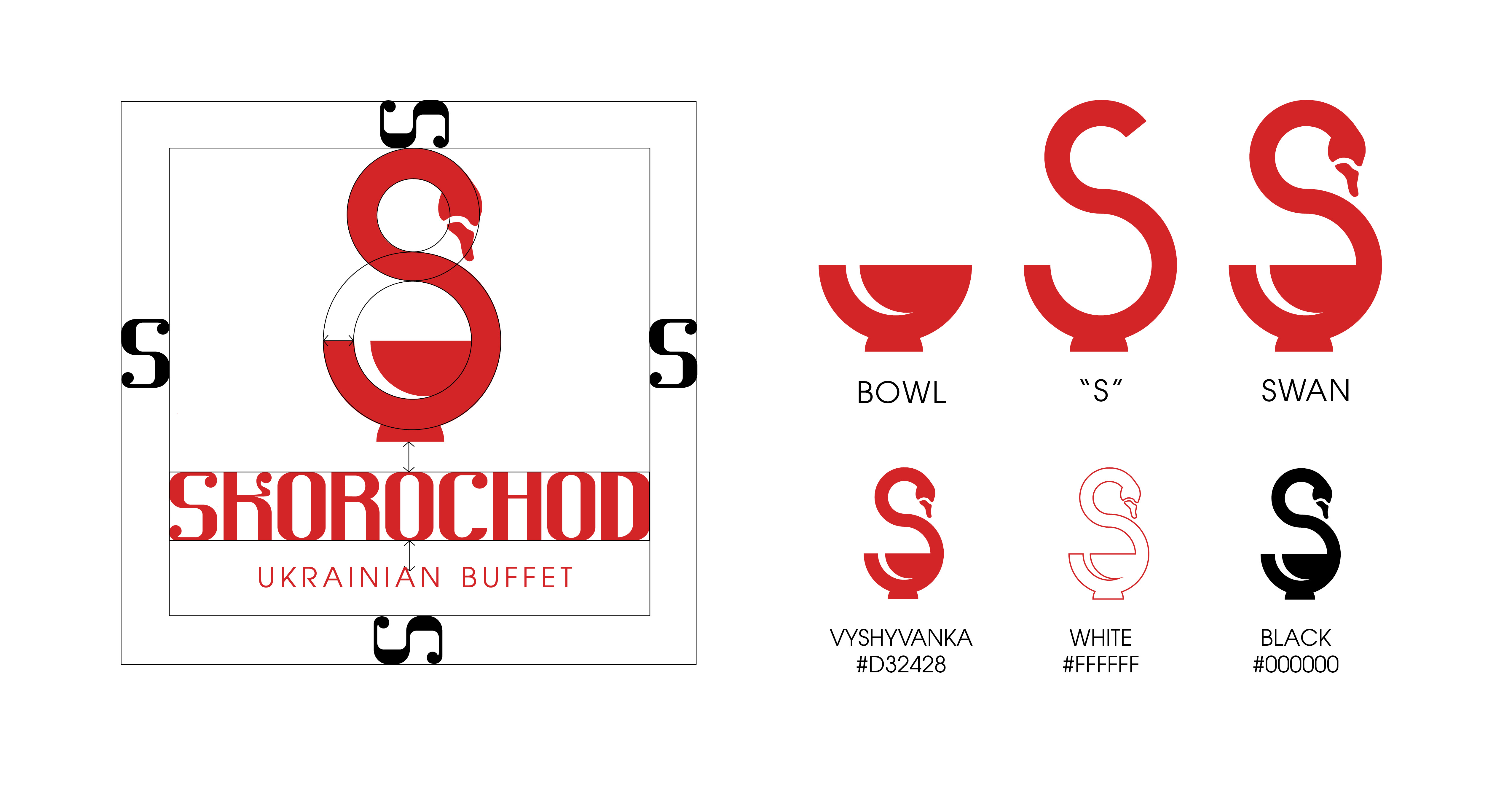
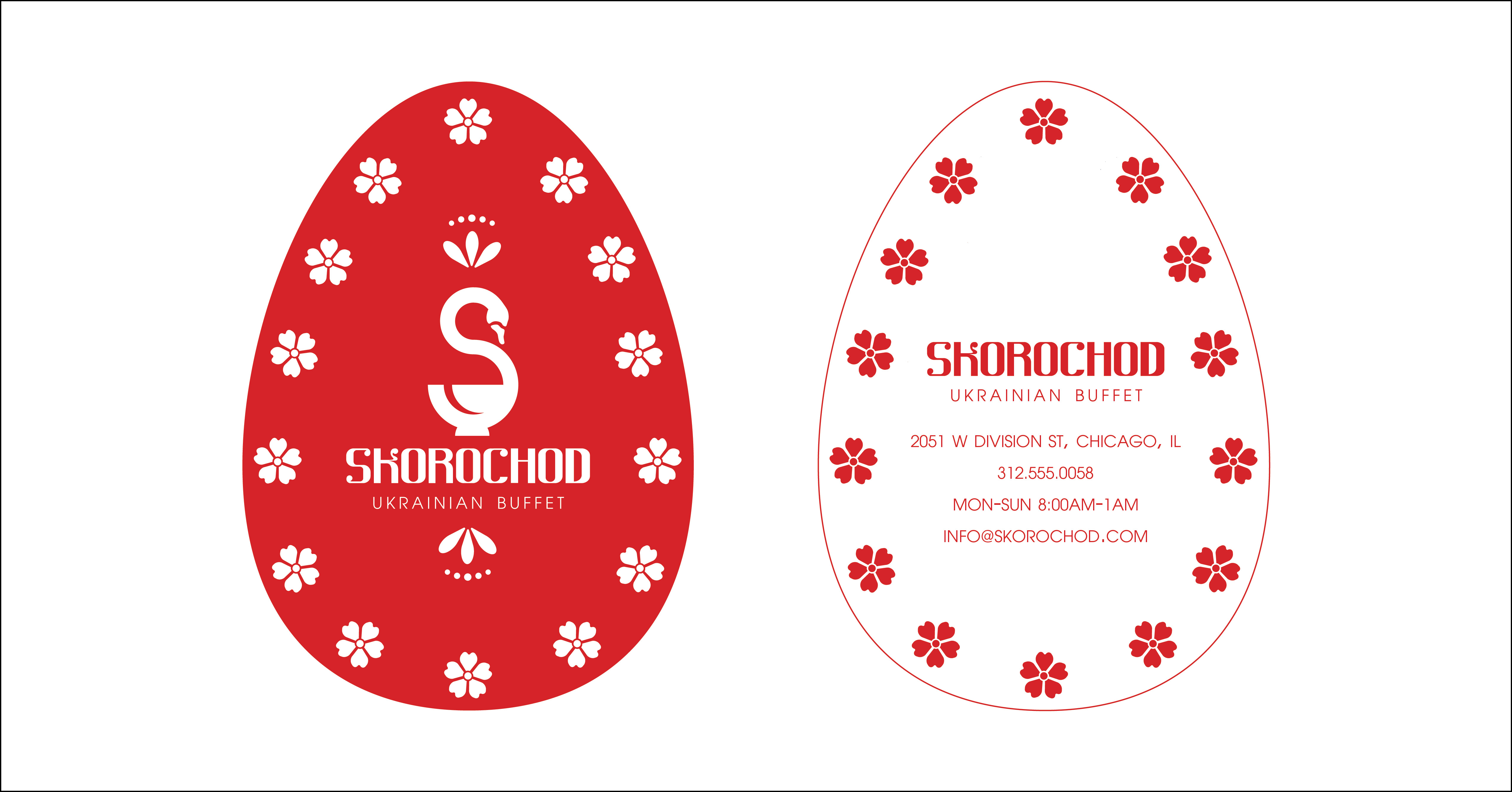
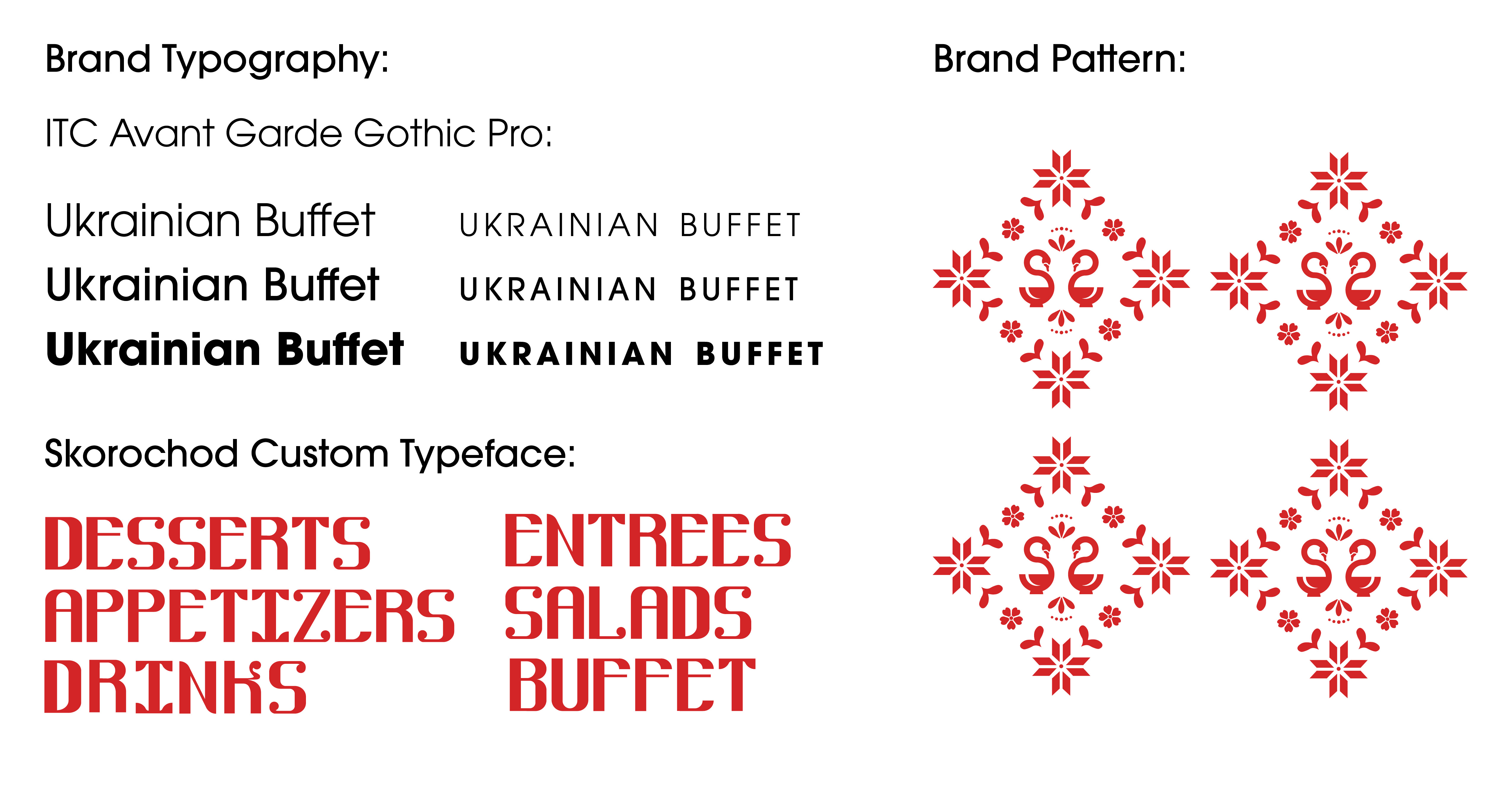
The red and white color pallette for Skorochod lends itself to the colors used in traditional Ukrainian cross-stitching called Vyshvanka. This embroidery appears mostly shirts but can be done on any kind of linen. The brand pattern also lends itself to this kind of cross-stitching.
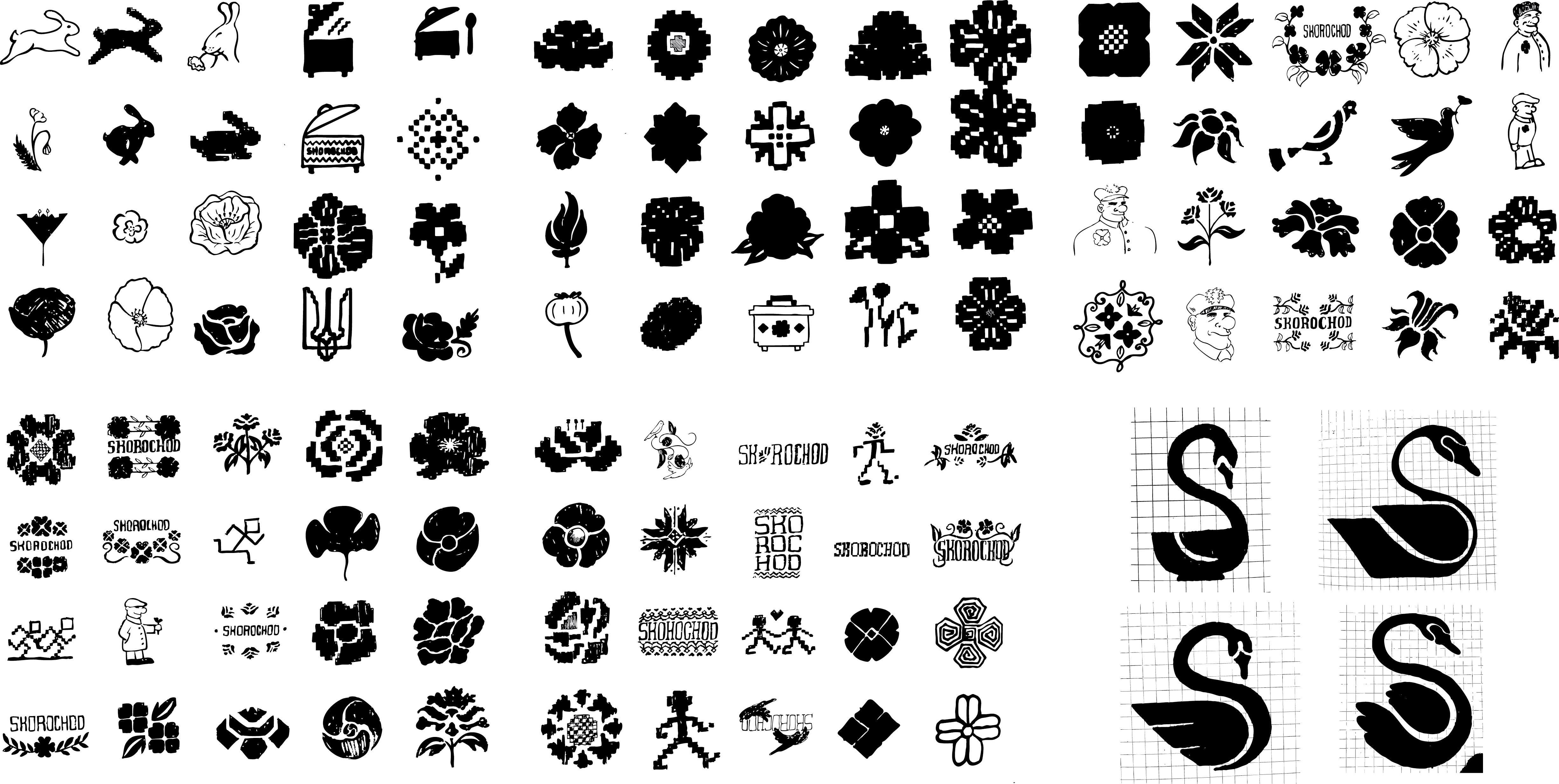
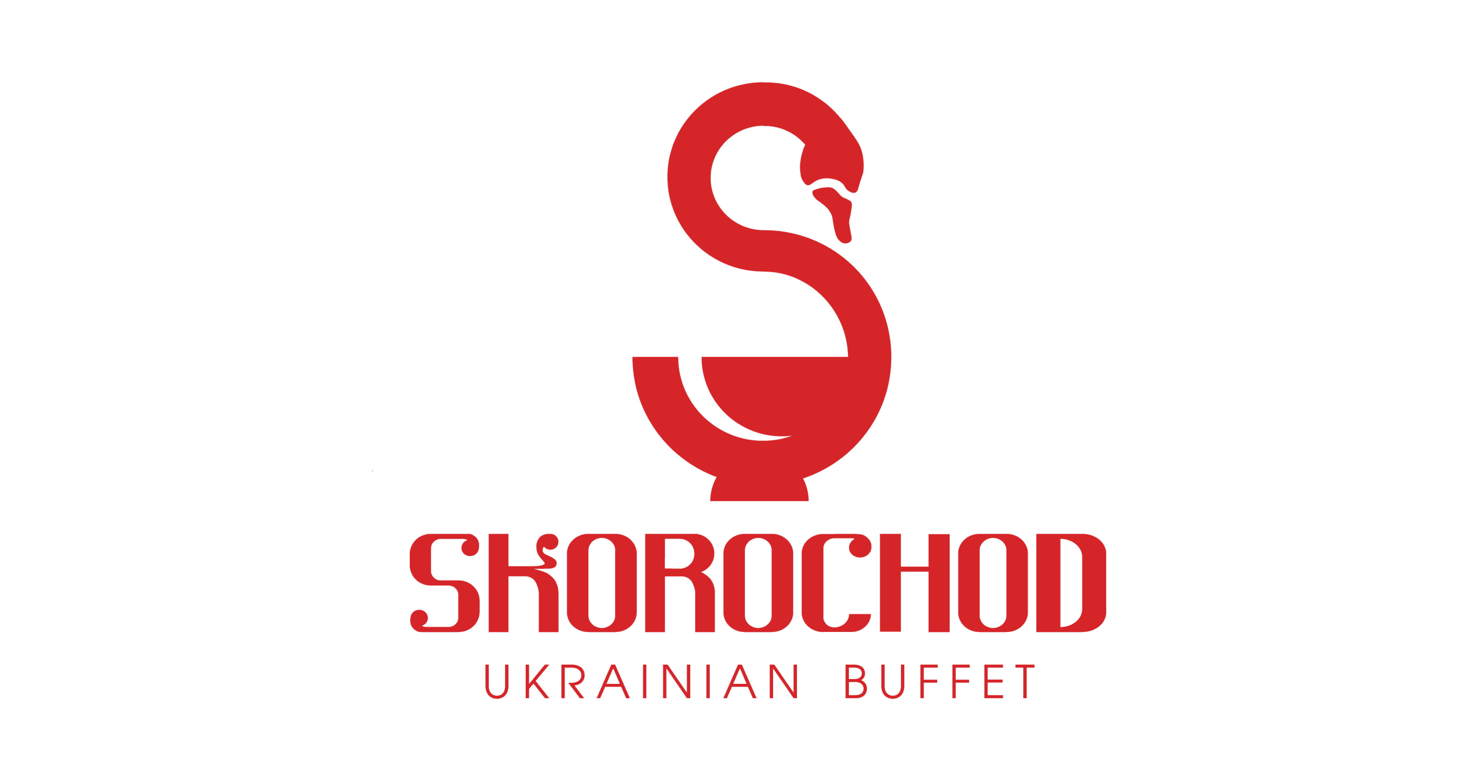
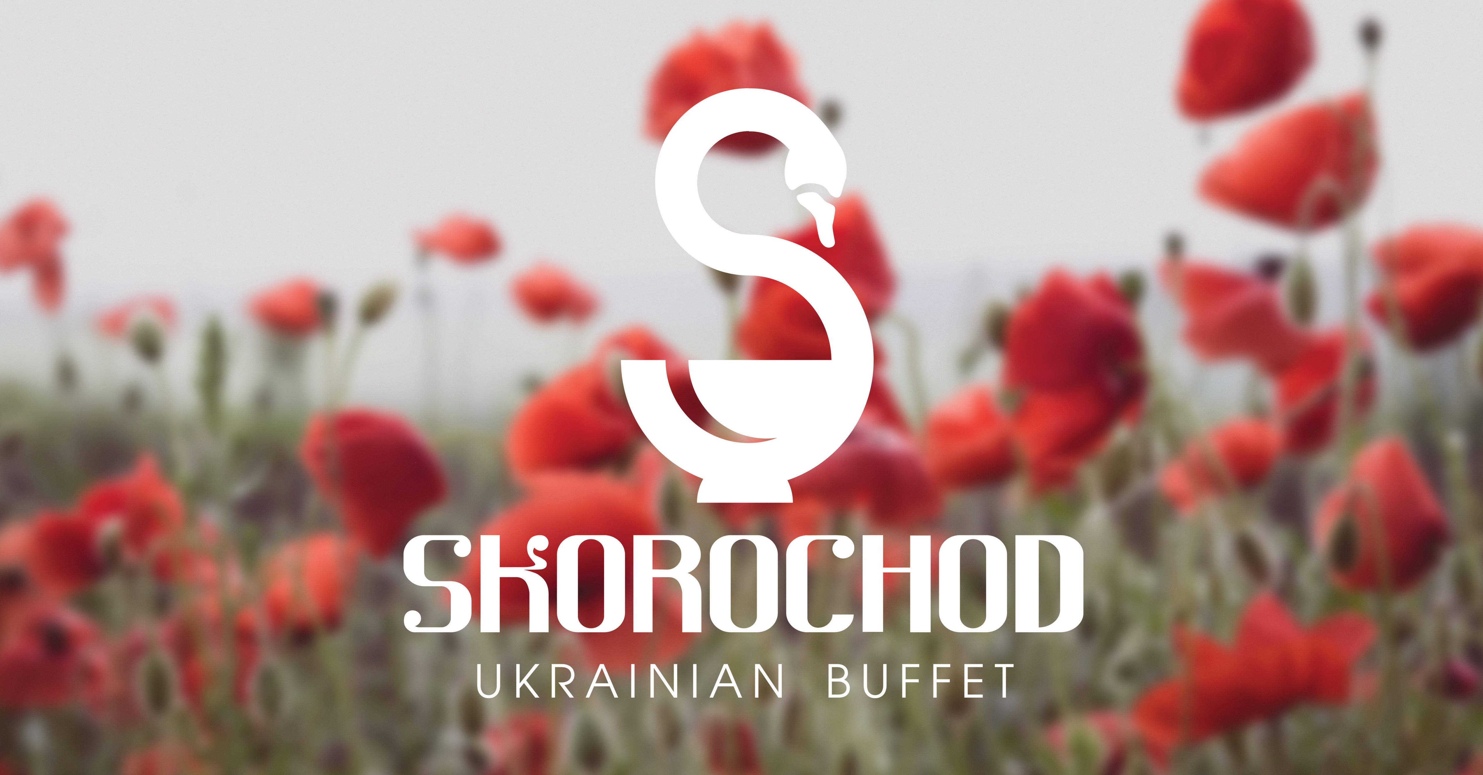
The final logo is a combination of a swan, a bowl and an "S" for Skorochod. Swans represent love and togetherness in Ukrainian culture. It's combination with a bowl represents food as a way of showing love. For a look into my process, see the sketches and moodboard below.